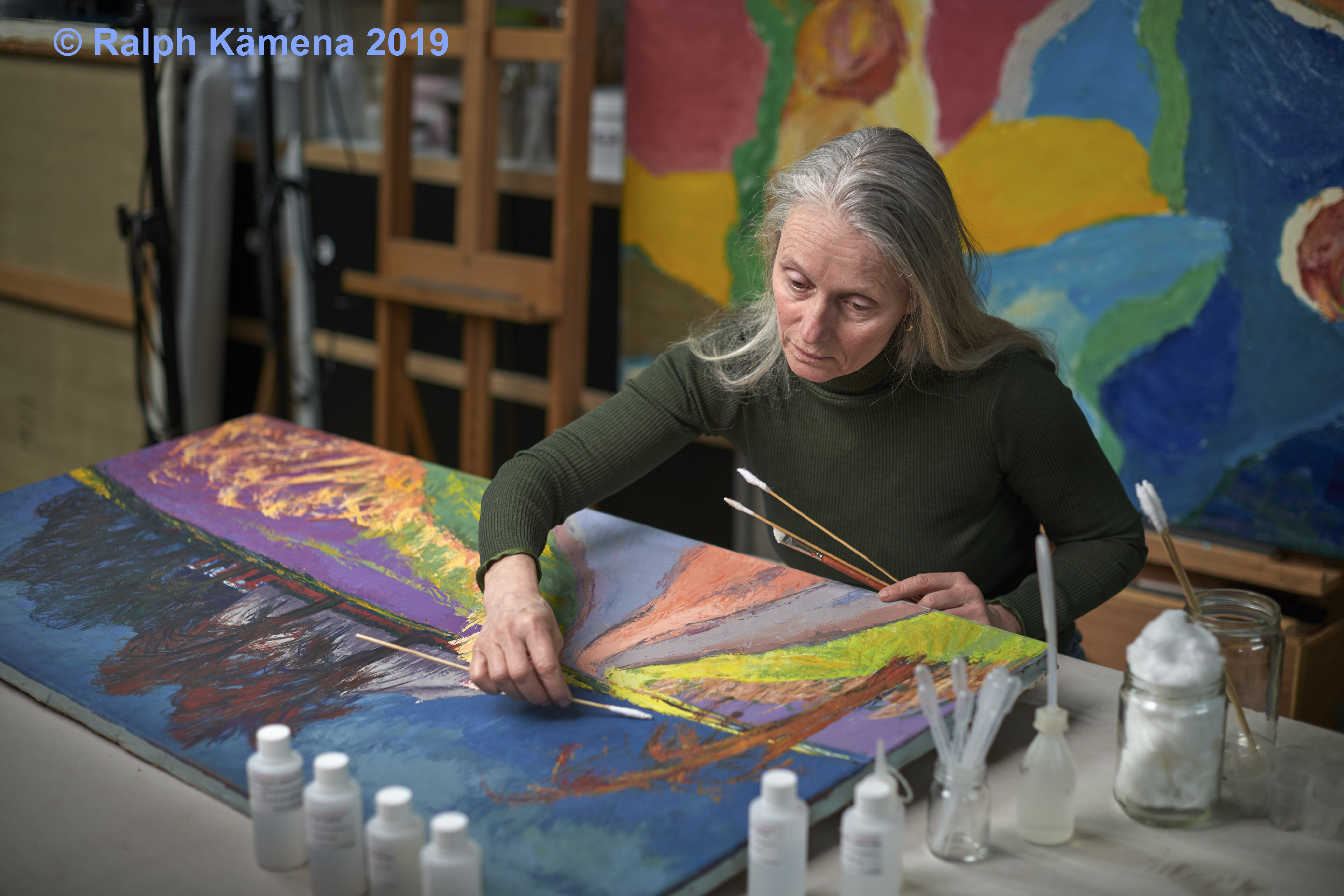
The artist interview and collaboration

During an artist interview and collaboration, the conservator collects the artist’s stories about his techniques, materials and history. The aim of the interview is to find information about the technique and materials the artist uses. The conservator is also keen to find out why he chose these materials during certain periods.
The conversation
The importance of artist interviews is to find out how the artist created the paintings. That is why there is also extensive talk about preparing cavases. But also about the painting technique and the choice of finishing layers. In an artist interview, the artist talks about the intentions he places in the work. In this way, the interview captures the artist’s thought. This allows the conservator to restore the paintings in a more nuanced way. Currently, Marjan de Visser’s interest is mainly in information about acrylic paintings. This in the context of increasing her knowledge about acrylic emulsion paints.
Interview with artist Bob Bonies
The artist Bob Bonies has been working with acrylic paint for many years . He provided valuable information about this paint and its applications in his artistic practice. The artistic practice is also a source of information and knowledge sharing for students of the University of Conservation and Restoration of Modern Art. Since Bob lives in the same neighborhood as Marjan, an artist interview with Bob is easily arranged.
Artists can request an interview for free.
collaborative projects with artists
Just Quist
Collaboration projects with artists also provide a lot of background information.

A good example of the artist interview and collaboration is the project with Just Quist. Together with this artist, Marjan de Visser conserved a painting that had become warped on a new aluminum frame. Before and during the work, the intentions of the artist and his works are discussed.


Jaap van den Ende

Marjan de Visser also regularly talks about his technique with Jaap van den Ende . He talks about how he mixes colors and about the appearance of the paint skin and why he varnishes his paintings. This is valuable information that should not be lost. This is also recorded.
While mixing the different colours of oil paint, Jaap is aware of the change in color – the darkening of the oil – during drying. He anticipates in this during mixing. In his own words, he can remix a colour flawlessly, including after darkening. For him, mixing is a very precise and important part of his visual language.
Another important part is the varnishing of his paintings. While working, the technique of ‘applying dry layers on top of each other’ creates a pattern of light and dark areas. For him, this is not part of the visual effect of the painting. All of his work from the 80 of the 20 e century to the present should be finished with a layer of varnish, which ensures that the work A level ‘overall’ shine. This is a soft glossy layer of varnish.

Daan van Golden
Daan van Golden was also actively involved in a conservation and restoration project of a painting from the collection of the Stedelijk Museum Schiedam. During the conservation, the artist was consulted in an artist interview and collaboration. He also visited the studio during the work and shared his thoughts on what his works should look like. He believes that his paintings should remain as pure as possible. If a painting is too badly damaged, it must be destroyed. In the case of “the red study” from 1982, he approved the choice of restoration.
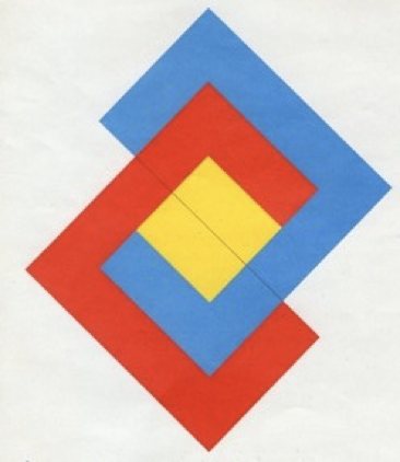
Peter Struyken

Artist : Struycken Peter
(Den Haag, 5 january 1939)
Performance The lawful movement, geometric abstract composition in black and white.
Size 50x50x1,5cm
Technique Lacquer on furniture board.
Date 60s of the 20th century.
Information about the object
The performance consists of four black strips on a white background. At the top is a black horizontal stripe, two diagonal black strips from the top left corner to the bottom center and bottom right corner and a fourth strip from the bottom left corner to the top right side.
The object is made of a furniture plate, the front of which is painted as the four sides around. First, the white layer was applied over which the black strips were placed. Tape was used for masking. The lacquer consists of a cellulose lacquer from ICI and is applied with a low-pressure spray.
Due to the humid climate in Curaçao, the glue used to make the furniture board has come loose and the paint has crackled. The top layer of the peeled wood is warped and has come loose in the corners.
In addition to the aging of the paint and the named crackle, the work has also suffered other damage: wear and tear, loss of paint and it is very dirty. It is remarkable that the wood has not been affected by termites.

barsten in de verflaag 
delaminatie van het multiplex
Specific information about the object by the artist
Because furniture board works, he then changed the process and in the following versions covered the boards with waterproof hardboard. The other two works were made of this. Before producing the works, he covered the board to obtain sharp lines.
In the artist interview with Peter Struyken on Curacao in 2009, Peter says that he experiences the crackle in the paint layer and the wood as “disturbing”, but “it does not disturb the work”. The work is the ‘idea’. He thinks the damage is less serious than expected.
The cellulose lacquer is manufactured by ICI (Imperial Chemical Industries PLC). ( This company was acquired by AkzoNobel on January 2, 2008)
In the corners of the work, on the sides is a black and white block. This is an ‘unintended solution’. It is not an extra detail, because: “You wink in church, not in art”.
The paints used were chosen for the high saturation of pigments, this was desirable and was also used in the works with red and yellow compositions. The saturation varies by colour.
general information by the artist
This work is the first of a series of three in black and white, it is the ‘test model’. Then two objects were made, both in a different size. The first was 100x100cm and then a small one of 90x90cm was made. Together with Bloemhof’s work of 50x50x1.5cm, there are three works all with the same motif.
The Centraal Museum currently owns the largest work. This work of 100x100cm with inventory number 14147 was donated in 1963 by Rietveld. The smaller version of 90x90cm (the copy) was commissioned by Mrs. Schröder and hung in the Rietveld House. The Truus Schröder heirs lent the work in 1988 to the Centraal Museum inventory number 26168. At the moment this is no longer present there, mention ‘gone’.
These works from the 1960s were not framed, the artist wanted his later works to be framed.
This was a great artist interview, unfortunately no collaboration resulted.
Pieter Laurens Mol
Pieter Laurens Mol also provided the necessary information during the treatment of his painting ‘De Lokroep’, which was damaged. Contact with the artist was by email, but the quality of this artist interview did not diminish. Read his reaction below that I think is important to share with colleagues.
reaction of the artist
Thank you very much for sending us the restoration work and results in the form of an extensive conservation report with regard to ‘De Lokroep’. Thanks for the carefully considered approach, I can only say that the outcome certainly looks good.
However, for the record and in support of an “enriched image profile” with respect to the original problem, I would still like to make some additional comments about the materials:
Specific information about the object by the artist
s a painter’s pigment, pure lead red lead (so often called ‘sunset red’ among connoisseurs in the late nineteenth century) has been completely replaced in our modern times by newer products that could replace the general color value excellently and that are many times more stable.
Still, I had good reasons to use the ‘real’ lead red lead and I will mention a few:
lead red lead 1
1 / the notion of the chemically toxic nature.
2 / the ‘optically’ toxic character (the vigilante, vigilant, alarming color value)
3 / the earth-bound, the complementary to the sky-blue / the colour psychological value.
4 / the preservative value as a lead derivative (and that’s how I made a true ‘saturnine’ painting)
5 / the very early, classical pigment – the Latin ‘minium’ (exclusive for this substance and our concept ‘miniature’ is derived from this, one now also speaks of iron menie, but this is biased and factually incorrect)
lead red lead 2
Well, the paint I applied is a mix of my own from various origins; presumably on the basis of the majority consisting of technically pure pigments (old-fashioned industrial red lead) and chemically pure pigments such as painters’ pigment (now also called old-fashioned and withdrawn from the market …) In the long term, it is almost impossible to know how such an experimental mixture will start to behave. The general condition itself is unpredictable anyway, we all know that lead red lead is unstable…! Over the years I have sometimes seen it turn away to a wonderful “pale pink”, but I have also seen it darken to a mysterious numb gray…. I’ve been using lead red lead since the early 1980s. So it all depends; in many situations – as in my case – it is still perfectly OK after about 25 years. A work of art is a living product, isn’t it? I am at peace with changeability and generally, I also welcome the slight shifts of characteristic qualities specific to the applied material, with which of course also the private reporting/expression shifts as an intrinsic, conceptual condition.
In short, I am aware of the possible shortcomings, I fully accept this uncertainty and I approach all of this with open arms.
Restoration future
Between us, we are obviously not dealing with a small ‘Goldreyer story’ and when I look at the photos of the restoration it looks good, but the addition of high-quality products on an original ground and base with such a low profile does challenge us and presents us with a new, unknown riddle as to the effects in the future!
Some scars are pretty sexy; I’m curious!
With warm regards from, Pieter L. Mol